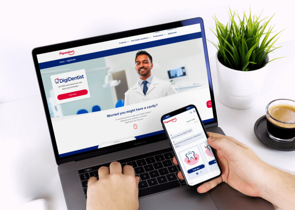

Unilever UK, recognizing the potential of virtual assistants, tasked us with designing and branding a chatbot for their leading oral care brand, Pepsodent. Christened "DigiDentist," this chatbot would become a friendly and informative virtual assistant for users. Pepsodent, a trusted name in oral care for over 100 years, aimed to leverage DigiDentist to tackle common dental concerns and offer personalized recommendations based on user inputs and behavior. Our team took on the challenge of designing DigiDentist's avatar, user interface screens, and the interactive experience itself. Credits: The responsibility of redesigning was undertaken as a part of my employment with ‘The Smarketers’. Please visit Smarketers for more details.
For DigiDentist, the Pepsodent chatbot by Unilever UK, I spearheaded several design aspects:
Through these contributions, I helped create a visually appealing, informative, and user-friendly chatbot experience for Pepsodent users.
DigiDentist’s chat interface was meticulously designed with mobile users in mind. This prioritizes a clean, clear, and intuitive experience for anyone seeking oral care guidance on their smartphone. The design seamlessly integrates with Pepsodent and Unilever’s existing brand guidelines, ensuring visual consistency and a familiar feel for users.
DigiDentist’s dedicated landing page serves as a user-friendly introduction to the chatbot. This webpage features a responsive design, ensuring optimal viewing and navigation across various devices, from desktops to tablets and smartphones. The design adheres to Pepsodent and Unilever’s established brand guidelines, creating a visually cohesive experience that aligns with the chatbot itself. This consistency fosters trust and familiarity for users encountering DigiDentist for the first time.