Tveshaj

Inbound Partners Website

About Client & Project

Inbound Partners, as an e-Verified employer, furnishes the Social Security Administration (SSA) and, if required, the Department of Homeland Security (DHS) with details from the Form I-9 for every new employee, ensuring the verification of work authorization.​

What did I do for Inbound Partners?

Challenges of the Existing Website:

  • Outdated Branding: The previous website lacked a cohesive brand identity, potentially featuring a dated logo, color scheme, and overall design language.
  • Static Content: Static landing pages limited flexibility and scalability, making it difficult to add new content, update information, or adapt to evolving marketing needs.
  • Limited User Experience: The website might not have been optimized for different screen sizes or devices, leading to a poor user experience on mobile phones and tablets.
  • Unclear Value Proposition: The messaging may not have effectively communicated Inbound Partners' unique services and differentiators.
  • Lack of Lead Capture: The website might not have had a clear call to action or efficient mechanisms to capture leads and convert website visitors into potential clients.

To address these issues, the following technical solutions were implemented:

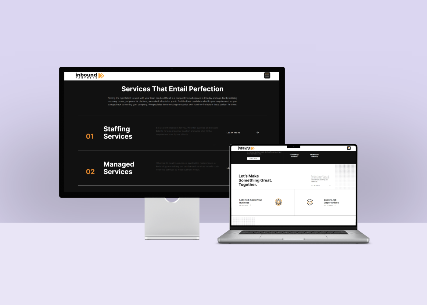
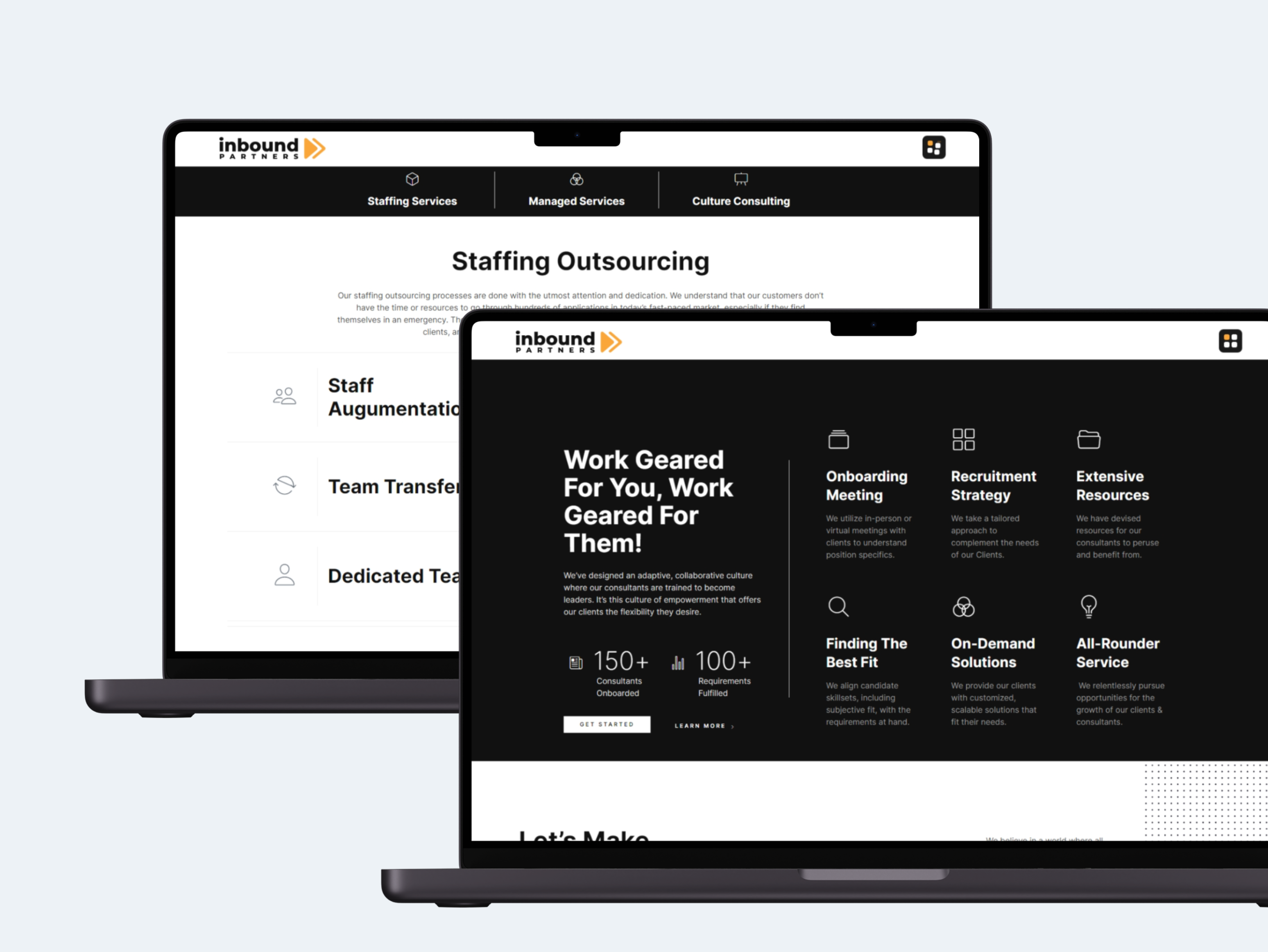
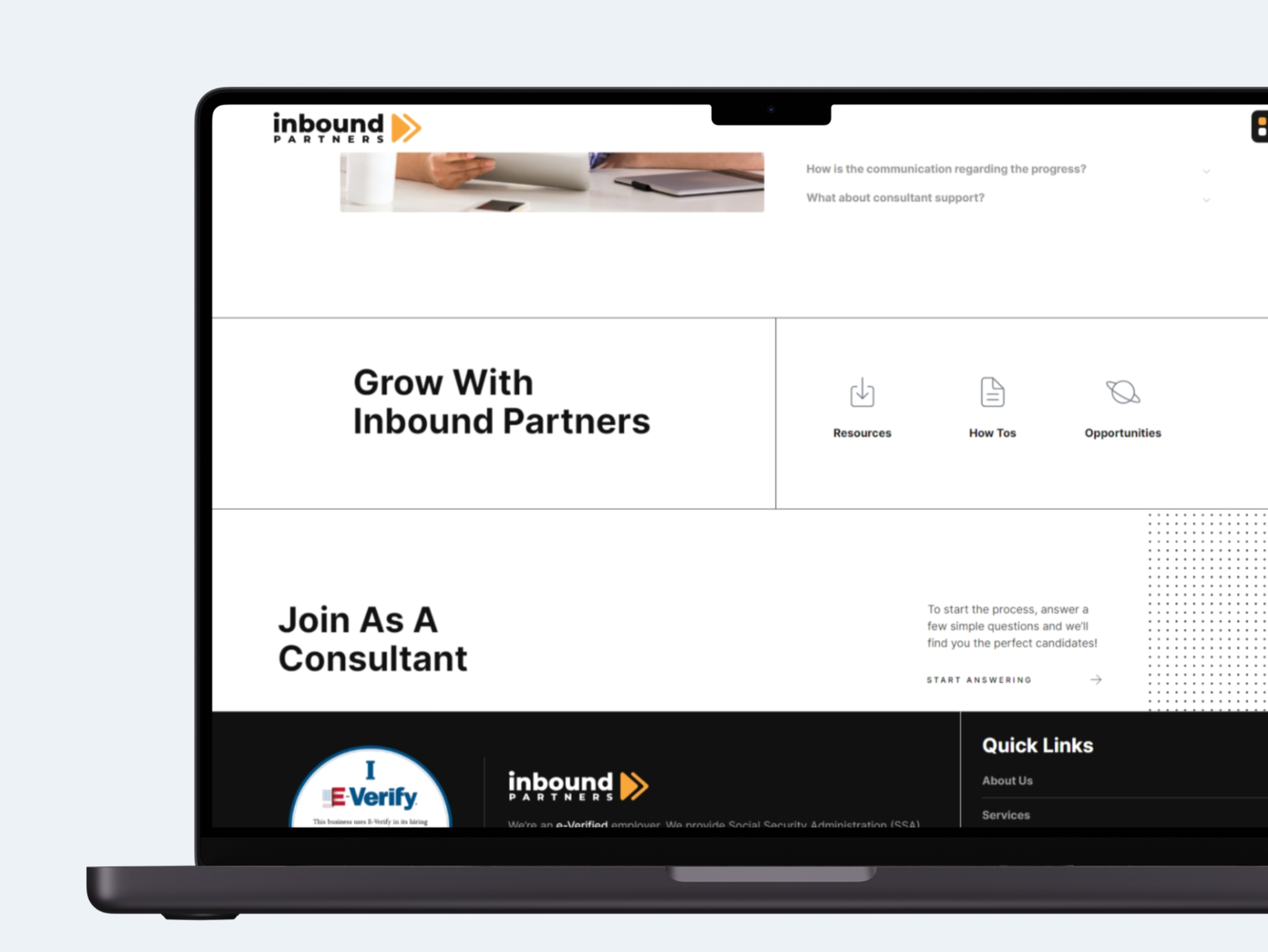
  • Developed a New Brand Identity: I designed a new logo, color palette, and overall design language that reflects Inbound Partners' unique brand and values.
  • Implemented a Scalable CMS: I selected and integrated a Content Management System (CMS) that allows for easy content creation, editing, and future website expansion.
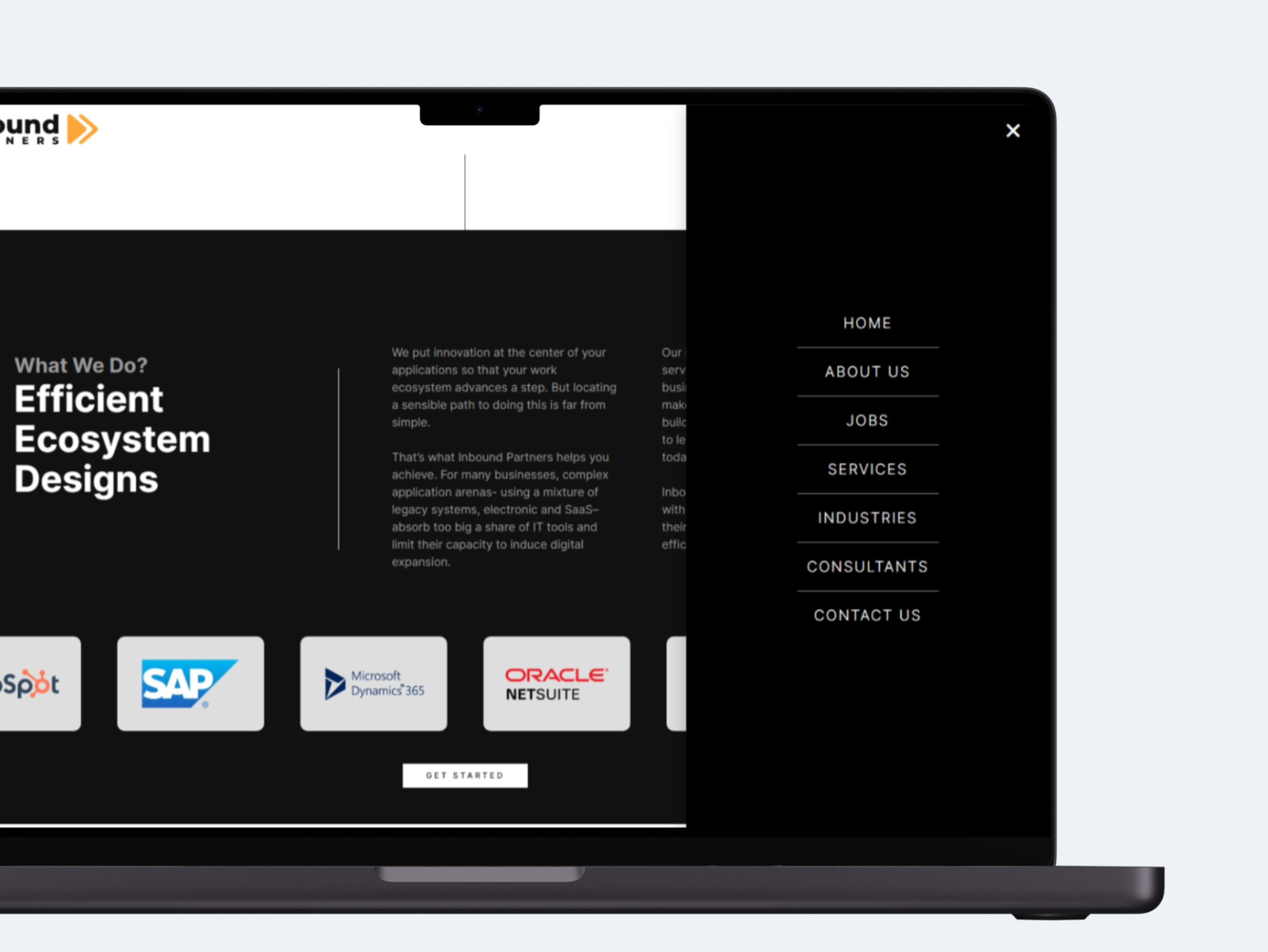
  • Ensured Responsive Design: I designed and developed a responsive website that adapts seamlessly to various screen sizes and devices, providing an optimal user experience for all visitors.
  • Crafted Compelling Content: I created engaging website copy that clearly communicates Inbound Partners' value proposition, services, and differentiators.
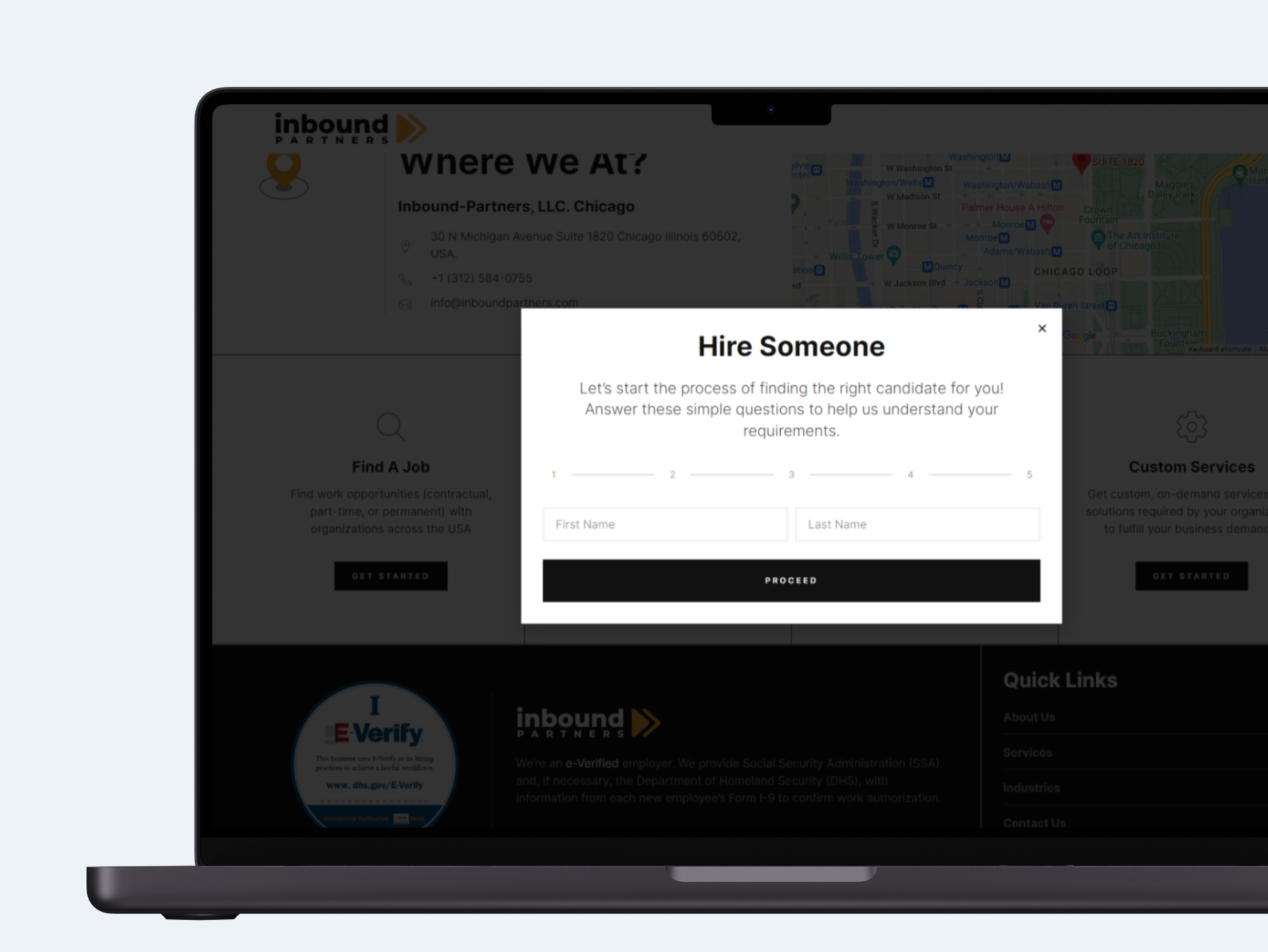
  • Optimized for Lead Generation: I implemented strategic calls to action and lead capture forms to convert website visitors into qualified leads.
  • Structured Content for Future Growth: I organized and categorized website content using different content types for better organization and scalability.

By implementing these improvements, I transformed Inbound Partners' website into a dynamic and user-friendly platform that effectively showcases their services, captures leads, and strengthens their online presence.

Brand Colors

#faa638

#111111

#ffffff

Typography

Let's talk about the project!​

New Logo: Trust & Progress

Simple. Bold. Forward.

The redesigned logo embodies Inbound Partners' commitment to progress. A clean triangle and arrow motif visually represents moving forward and achieving results. This simplicity builds trust with potential clients, reflecting Inbound Partners' reliable and results-oriented services.

Design Philosophy

Open & Spacious: A Breath of Fresh Air

The website embraces an open design philosophy. Ample negative space and minimalist elements create a clean and clutter-free user experience. This approach mirrors Inbound Partners' focus on clarity and efficiency, allowing visitors to easily navigate the site and find the information they need.

Seamless Navigation

Discreet Flyout Menu

The redesigned website utilizes a flyout menu for a streamlined and unobtrusive user experience. This approach prioritizes content while providing easy access to navigation options through a sleek, side-sliding menu. The minimal design complements the overall website aesthetic and ensures a smooth browsing experience for all visitors.

Iconography

Simple & Engaging

The iconography prioritizes clarity with clean lines and consistent weights. Most icons utilize a dual-tone approach, ensuring easy readability and visual hierarchy. To add a touch of brand personality, we've incorporated brand accent colors as highlights. For select icons, we've taken it a step further by utilizing Lottie files to create subtle micro-animations. These animations add a touch of visual interest and enhance the user experience without sacrificing website performance.

Content Organization

Seamless Navigation with Custom Post Types

The website utilizes custom post types to create dedicated sections for resources, how-to guides, and careers pages. This targeted approach goes beyond simple categorization. Each section functions as a mini-hub, offering a focused and organized user experience. Visitors can easily navigate to the specific content they require, saving them time and streamlining their journey through the website.

Engaging User Journeys

Multi-Step Forms in Action

The redesigned website utilizes interactive popups to capture user attention and provide targeted information. A multi-step form housed within the popup itself. This approach allows for the collection of detailed user information in a clear and engaging way, without overwhelming visitors on the main page.

iverify-661bcab88c18957d8c827b32

iVerify Certified

Drop in your details, I'll reply once I wake up.