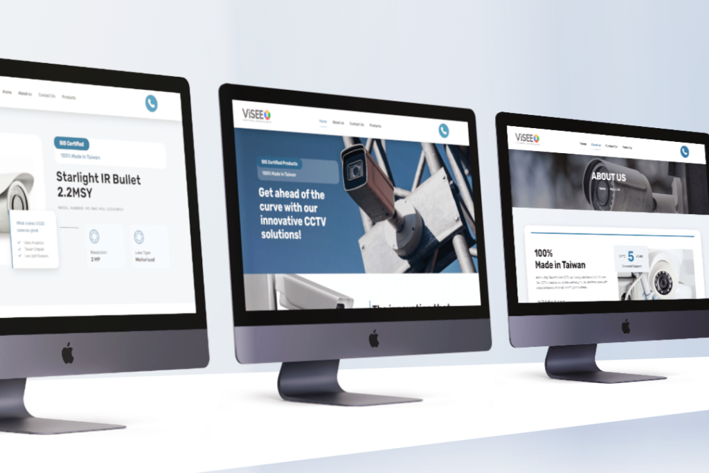
ViSEE Website Design

About Client & Project

ViSEE’s website was old, not secure, not viewable on mobile and very hard to make changes to. They needed to go through a lot of trouble to make basic changes/additions to the website, so this needed to change.

What did I do for ViSEE?

I took this opportunity to redesign the website and give it a clean and modern look befitting the tech they offer.

Brand Colors

#3e78a0

#2F5A78

#222222

#545557

#EDF2F6

#ffffff

Let's talk about the project!​

ViSEE Website Design & Development

Mobile First Approach

  • I redesigned the theme to give it a premium look and feel.
  • Removed all the stray links from the website, like Instagram links in the footer and social media links in the top bar.
  • The website has been equipped with tools for the SEO team to get started right away.

With industry best practices we ensured the website has a mobile-first experience. We developed it so that it is highly scalable and the client can make changes and add content to the website without any dependencies.

Custom Framework

Add Products with Ease

  • Redid the ‘products’ architecture to make it scalable and faster to load.
  • Custom post types have been developed to enable the client to add different products across different categories in with least possible steps.
  • The website is scalable and secure.

dynamic-product-grid-66102859c20d99566445af41

Dynamic grid showing latest products

about-us-page-66102793c20d99566445af1b

About Us Page

distributor-lead-gen-661027a0c20d99566445af20

Lead Capture Page for Distributors

integrated-calendar-66102811c20d99566445af31

Integrated Team Calendar for Lead Management

contact-us-66102a36c20d99566445af51

Contact Us page to capture visitor enquiries

Drop in your details, I'll reply once I wake up.